+of+DSCN2645-pola.jpg)

Jacques Louis David, Oath of the Horatii, 1784

Henri Matisse, Le Bonheur de Vivre, 1905-6
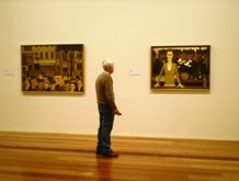
The origin of colour as an independent aspect of art really begins in the late nineteenth century, with artists beginning to revolt against the rule-based art of the Academy. To understand this change, look at the differing ways colour is used in Jacques Louis David's Oath of the Horatii and Henri Matisse's Le Bonheur de Vivre. This is a radically simplified version of the transition, and there are twenty years between th paintings, but even with this gap taken into consideration, the artist's conception of colour has nonetheless changed significantly. For David, colour is simply a means to an end, a building block which comes a distant second to the main player, which is of course, the narrative. Colour works to balance the composition and direct the viewer's eye, but this is all. It is certainly not appreciated on pure aesthetic terms the way it is in Matisse's work. Here there is an almost joyous revelry in colour, the narrative is no longer the most important aspect. Can we know the specifics of what is happening in Le Bonheur de Vivre? Not really. Do we care? Very little, it is enjoyable without any need for a structuring narrative.
In addition to Matisse's exploration of the emotive qualities of colour, scientific discoveries in the field of optics prompt his contemporaries to realise that the way in which we see things in the world is far more complex than the assumption that "red item -> looks red -> paint it red." Shadows didn't neccesarily need to be a darker tone of the object, but could instead be blue, purple, brown. And rather than flat colour, a multitide of different coloured brush strokes could be used to better convey the way colour is perceived by our eyes.
Anyway, I have got somewhat carried away here. What got me on this train of thought to begin with? Well, I discovered a couple of interesting links dealing with colour, and it got me thinking about why colour is important, and it also made me realise that it is very much something we take for granted. We are surrouded by colours, often we'll encounter an intense variety before we even reach the front gate in the morning. It is only when, due to circumstances, weather or otherwise, the range of colours in our existence is cut short, that we begin to appreciate this variety. We also are usually unaware of the extent to which colour effects us psychologically. We make connections between colours and various states of being, yet colour associations are socialised rather than innate. This notion of the crossroads between colour and emotions is explored in a study entitled "Emotionally Vague." Actually, more broadly speaking it is a study of the ways in which we articulate our emotions, but I find the colour aspect interesting in that it highlights my point that there are no right or wrong answers when it comes to colour associations.

The second link is to the online content for MOMA's 2008 exhibition, Colour Chart: Reinventing Colour from 1950 to Today (credit for both this and the Emotionally Vague link goes to elemele). The site charts artists' explorations of colour throughout the twentieth century, taking as its point of departure Marcel Duchamp's Tu M' (1918). It also features videos of the major installations which took place for the exhibition, most notably one by Jim Lambie, in which the gallery floor is covered by multicoloured tape. Lambie is a Turner Prize winner, whose large scale installations usually revolve around redefining space through the use of coloured tape. Sounds simple, but the results are quite extraordinary, and six months later, I'm still a bit sad that I managed to miss his show at ACCA.

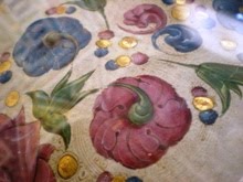
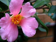
The last bit of colour I feel the need to share is far from informative, or intellectual, but it IS arty and inspiring. After months and months of window shopping and dreaming and carrying on, I have finally got myself a Holga. No, that's not the name of a chair from Ikea, it's a low-tech Lomographic camera, designed to give my photos an unexpected touch of colourful low-fi magic. Its all a bit experimental, but hopefully with copious amounts of time and patience, I should be able to produce images along these lines. I will also spend copious amounts of money on film and developing along the way, but hey, what's a little cash in the pursuit of photographic magic? Holgas come in basic black, but as soon as I set eyes on the fire-engine red version, I knew I had to have it. So, without further ado, colour-love #3:


.jpg)


No comments:
Post a Comment