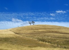
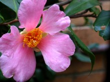
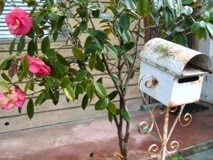
This video from London based singer-songwriter Alessi's Ark is made up of hundreds of photographs taken on Lomography cameras. Just the nudge I needed to take my Holga out for a walk again.
Found via Meet Me at Mikes. Thanks for sharing, Pip!
Apr 28, 2010
Back in the world of the living
Or rather, back in the world of the web. You really don't realise how much of your life is tied to the internet until circumstances take it away. Finally the net is up and running at my new house, and I can start to feel like I'm connected to the outside world again.
It's good to be back. Expect more arty/photographic goodness soon.
It's good to be back. Expect more arty/photographic goodness soon.
Apr 8, 2010
030910
Broken Bells is a collaboration between producer Dangermaus and Shins frontman James Mercer. Given that the release date of their self-titled album also happened to be my birthday, it's really not too surprising how awesome it is. Anything that happens on the ninth of the third is clearly destined for greatness.
The High Road
Broken Bells | MySpace Music Videos
My favourite track is The Ghost Inside, but it doesn't seem to have a video released yet. You can listen to it here though. Soooo good.
The cover art Broken Bells is by the very talented Jacob Escobedo. The more ritzy, deluxe versions of with the album feature even more of his work, which is in equal parts trippy, colourful and amazing.
all images from http://jacobescobedo.com/
PS: The Broken Bells album launch? Oh, you know, just a casual rooftop laser party. I'm not jealous at all, Los Angeles.
(video found via Jacob Escobedo's website)
Labels:
art,
Broken Bells,
illustration,
Jacob Escobedo,
music
photographing silence: michael kenna
Beautifully soft photos by American based photographer Michael Kenna. They make me want to go and shoot endless rolls of black and white film. Having a photogenic subject like New York wouldn't hurt either...
All images from Michael's website.
Apr 4, 2010
Meanwhile, in Melbourne...
....I got to try my hand with a Canon 30D and some fuji velvia. Mmmmm, slide film. These are both from February...ooops...
Budget-girl blues
Jessica Hische, Daily Drop Cap 1st Edition
image credit: Lamington Drive
flatmates and I have just signed the lease to a new house, and while I am endlessly excited about the big move, new house = new expenses = one rather battered and bruised wallet. As such I have made a few resolutions for the next few months. No more buying magazines to get me through my wait for the train. No buying clothes, unless they are ten dollars or less (ahoy, Savers!). No more going out for dinner - daytime coffee will suffice. And last but not least, no mroe buying arty things, especially seeing as I have a backlog of prints which need to be framed. It is in this spirit that I post this amazing prints by American graphic designer Jessica Hische. Jessica recently had a show at my favourite Melbourne gallery, Lamington Drive (home of my very first art-purchase). Largely based around Jessica's Daily Drop Cap project*, the show featured an entire alphabet of intrically designed letters, and additional text-based work. But my favourite things of all, the ones tempting me to break my resolution just days after it was made, were her charts of her drop-cap series, featuring the entire alphabet on one print. For now, I will post one and pretend that this is in fact the same as buying. Then in a few months, maybe, just maybe there will be a few left. Fingers crossed and i's dotted!
images from Daily Drop Cap 1st Edition from Jessica's website
*Go check it out! Jessica is offering a new drop cap a day to bloggers to use to beautify their posts.
The M & Y at the beginning of this post are, of course, from Daily Dropcap
Apr 3, 2010
a colourful delaying tactic
I am well behind in uploading my photos. They are here, they are lovely, but do they ever take a lifetime to scan. For the meantime, obsessive compulsive me is enjoying grouping them by colour on flickr. Red, orange and blue, not to mention an excessive black and white set. Ahhhh photo-OCD....will you ever win?
Apr 1, 2010
speaking of leaves...
Way back when I first started this blog, I posted about illustrator Christoph Neiman and his blog for the New York Times, Abstract City. His illustrations take the form of themed series, and his use of unusual materials (coffee, power cords, lego, woven paper) makes his work witty, surprising and enjoyable. This time it's with autumn leaves, in the series Biodiversity. I think the walnut is my favourite. How about you?
Subscribe to:
Comments (Atom)
+of+DSCN2645-pola.jpg)





.jpg)


