Apr 8, 2010

photographing silence: michael kenna


Beautifully soft photos by American based photographer Michael Kenna. They make me want to go and shoot endless rolls of black and white film. Having a photogenic subject like New York wouldn't hurt either...


All images from Michael's website.

Apr 4, 2010

Meanwhile, in Melbourne...

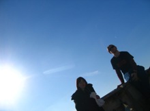
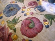
....I got to try my hand with a Canon 30D and some fuji velvia. Mmmmm, slide film. These are both from February...ooops...

Budget-girl blues

 Jessica Hische, Daily Drop Cap 1st Edition 
image credit: Lamington Drive

 M
 Y
flatmates and I have just signed the lease to a new house, and while I am endlessly excited about the big move, new house = new expenses = one rather battered and bruised wallet. As such I have made a few resolutions for the next few months. No more buying magazines to get me through my wait for the train. No buying clothes, unless they are ten dollars or less (ahoy, Savers!). No more going out for dinner - daytime coffee will suffice. And last but not least, no mroe buying arty things, especially seeing as I have a backlog of prints which need to be framed. It is in this spirit that I post this amazing prints by American graphic designer Jessica Hische. Jessica recently had a show at my favourite Melbourne gallery, Lamington Drive (home of my very first art-purchase). Largely based around Jessica's Daily Drop Cap project*, the show featured an entire alphabet of intrically designed letters, and additional text-based work. But my favourite things of all, the ones tempting me to break my resolution just days after it was made, were her charts of her drop-cap series, featuring the entire alphabet on one print. For now, I will post one and pretend that this is in fact the same as buying. Then in a few months, maybe, just maybe there will be a few left. Fingers crossed and i's dotted!
images from Daily Drop Cap 1st Edition from Jessica's website

*Go check it out! Jessica is offering a new drop cap a day to bloggers to use to beautify their posts. 
The M &  Y at the beginning of this post are, of course, from Daily Dropcap

Apr 3, 2010

a colourful delaying tactic

I am well behind in uploading my photos. They are here, they are lovely, but do they ever take a lifetime to scan. For the meantime, obsessive compulsive me is enjoying grouping them by colour on flickr. Red, orange and blue, not to mention an excessive black and white set. Ahhhh photo-OCD....will you ever win?

Apr 1, 2010

speaking of leaves...

Way back when I first started this blog, I posted about illustrator Christoph Neiman and his blog for the New York Times, Abstract City. His illustrations take the form of themed series, and his use of unusual materials (coffee, power cords, lego, woven paper) makes his work witty, surprising and enjoyable. This time it's with autumn leaves, in the series Biodiversity. I think the walnut is my favourite. How about you?


Art crush - Fiona Hall

I first saw the work of Australian artist Fiona Hall at the NGV's Contemporary Commonwealth exhibition in 2006. Leaf Litter, from 2000 was exhibited alongside Tender, from 2003-05. Both pieces deal with the conflicted role that money plays in contemporary, multicultural society, and contrast the socialised concept of money, with natural, organic items - respectively leaves and bird nests.

 Fiona Hall, Tender, 2003-2005
images from Roslyn Oxley9


Fiona Hall, Leaf Litter, 2002
images from Roslyn Oxley9

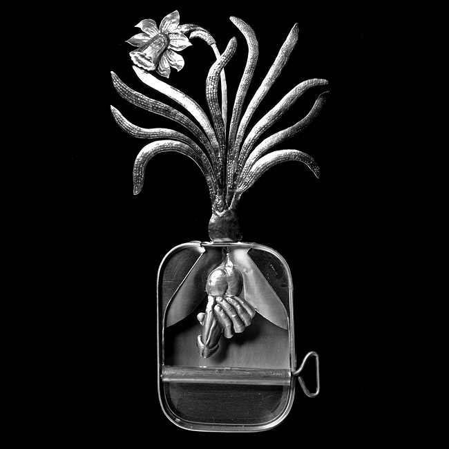
In an earlier series which I haven't seen in person, Paradisus Terestris, Hall creates intricate botanical sculptures out of sardine tins. The delicate, silvery sculptures speak of the vulnerability of plant species, and of the biodiversity present in Australia. Furthermore, the name of the series evokes themes of the garden of Eden, 'Paradise on Earth.' NB these ones are somewhat NSFW. Just a heads up.


  Fiona Hall, Paradisus Terestris 1989-90
images from Roslyn Oxley9

do the words lovely and hairy ever appear together?

Only when they are being used to describe the work of Evaline Tarunadjaja!

 Yet again this is a post-show-post. Evaline's deliciously light and airy pen and watercolour illustrations were on show at No Vacancy gallery last month. Evaline's work is full of long limbed, mermaid-like girls with hair mere mortals can only dream of. The level of detail and the intricacy of her line work, not to mention the delicacy and sensitivity with which she uses colour, are just astounding. Definitely one to keep an eye on.


All images from Evaline's website, here. She also has a blog and online store.Moreover, if you want to read a more indepth article with her, go here.
Related Posts with Thumbnails