When I originally started drafting this post, it was debilitatingly hot in Melbourne. The kind of weather in which walking to the shop to buy an ice cream is the most activity you can manage. It reminded me of when I was in Perth at the start of the year, walking slowly and stopping often in an attempt to deal with the heat (the sunshine and blue skies were appreciated, it was just soooo hot). At the time I was listening to The XX and thinking how something about their music made me think of icy coolness. And I got to thinking about it again, feeling hot and sticky in Melbourne, listening to Fever Ray. Somehow, her songs are arctic and chilly to me. Am I insane? Probably. But I still feel refreshed after listening to them. Also, as if to punish me for whingeing, at the time I finish up this post, Melbourne is cold and showery. Go figure. Does anyone have any good warm-up song suggestions?
Dec 12, 2010
Nov 24, 2010
Oh yeah, I like to take photos...
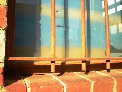
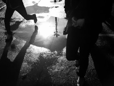
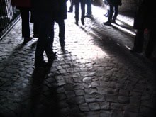
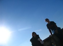
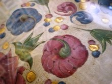
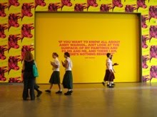
Somehow inbetween thesis writing sessions, I did actually take some photos. I took forever and a day to scan them, so some of these are from early on in the year. But that's part of the beauty of film photography, right? You forget about that roll of film, sitting undeveloped in the drawer, and the prints are a happy surprise.
These were taken on various occasions in various places, from April to June. Given that it's now November, there are clearly many more to come.
These were taken on various occasions in various places, from April to June. Given that it's now November, there are clearly many more to come.
Nov 23, 2010
Klimt 2.0
Remember how jazzed I was about Hold Your Horses' video clip for Seventy Million, which featured all the famous paintings, and was fun and silly at the same time? Well, less silly but still awesome is Spanish magazine Ae's take on Gustav Klimt, by photographer Moises Gonzales. Witness:
That third one is my favourite. So much detail! So many flowers! I think far from rolling in his grave, old Mr Klimt would love it too. Found at bumbumbum, via Unstage.
That third one is my favourite. So much detail! So many flowers! I think far from rolling in his grave, old Mr Klimt would love it too. Found at bumbumbum, via Unstage.
Nov 19, 2010
an ocean and a return
still from Ocean Without a Shore Venica Biennale installation
image credit www.billviola.com
Midway thorough writing my thesis, before the self-imposed blog hiatus, I started composing a post about my trip to see the National Gallery of Victoria's installation of Bill Viola's Ocean Without a Shore. I didn't really know much about Viola beforehand, but the Age's writeup described the work as "epic, religious, devastating personal, poetic." This was something I needed to see for myself.
Ocean Without a Shore was first exhibited at the 2007 Venice Biennale, where it was installed inside the tiny fifteenth century church of San Gallo. The work explores the tentative threshold between dead and living, or as Viola himself puts it, "the presence of the dead in our lives." The installation consisted of three large video screens superimposed over the altars of San Gallo. Shadowy figures walk towards the viewer, becoming increasingly clear, until they break through a wall of water, imperceptible until the moment of contact. The violently cascading wall of water serves as a representation of the threshold between life and death: the intangible yet ever-powerful 'veil' separating the living from loved ones who have died. Once on the other side of the water wall, the figures appear in full colour, their gazes confronting and emotional. After a short time, each turns and passes back through the veil of water. The figure gradually fades to obscurity, and is replaced by another, approaching one of the other two screens.
The National Gallery of Australia's installation of Ocean Without a Shore uses a small, darkened room to evoke the intimacy of the work's initial showing. Even without the church setting, the overall effect is overwhelming and emotive. Viola reminds his viewers of the extent to which humans are obsessed with death by powerfully conveying the desire to 'see' loved ones who have died. Regardless of one's stance towards religion and the afterlife, the sense of loss as each figure disappears through the veil is palpable. All this, for video projections of strangers. Why? Because Ocean Without a Shore addresses our relationship with death as a universal experience. Death, and its implications, are something everyone must grapple with, and one person is as powerless as another to thwart it.
image credit: designboom
The National Gallery of Australia's installation of Ocean Without a Shore uses a small, darkened room to evoke the intimacy of the work's initial showing. Even without the church setting, the overall effect is overwhelming and emotive. Viola reminds his viewers of the extent to which humans are obsessed with death by powerfully conveying the desire to 'see' loved ones who have died. Regardless of one's stance towards religion and the afterlife, the sense of loss as each figure disappears through the veil is palpable. All this, for video projections of strangers. Why? Because Ocean Without a Shore addresses our relationship with death as a universal experience. Death, and its implications, are something everyone must grapple with, and one person is as powerless as another to thwart it.
image source: designboom
(last image is of the Venetian church, San Gallo)
I had the idea that Viola was using the universal human experience as a means to evoke an emotional response but it didn't really crystallise until I saw another of his works, The Raft. Based on Gericault's Raft of the Medusa, The Raft is a short film, which shows a group of strangers (seemingly waiting for a bus?). They stand together, but apart, each studiously avoiding contact with the others. This continues for some time, with slow motion capture used to highlight the minutiae of the group's gestures. Then, just as excruciatingly slowly, a giant wave of water begins to appear from the left of the frame, crashing over and inundating the crowd of people. They are washed - no, battered - by a solid wall of water for what seems like an eternity. Finally, the water recedes, leaving this once nonchalant crowd completely bowled over, clinging to each other for comfort and security. Here the universal theme that Viola is dealing with is suffering. more specifically the unifying effect of collective suffering.
image credit: University of California Humanities Research Institute
Suffering also comes up in yet another Viola piece that I saw recently, this time at the Australian Centre for Contemporary Art. Unspoken features the faces of a man and a woman, projected onto panels of beaten metal - silver and gold, respectively. Both faces show signs of intense grief and anguish, which, as in The Raft, is further emphasised by Viola's use of slow motion. The panels glow in the darkened room in a way reminiscent of religious icons, an analogy which is borne out by their powerful emotive, almost mystical effect.
[Edit: after a bit of further research into The Passions, the series of works which Unspoken belongs, it transpires that Viola was studying late Medieval devotional images at the Getty Research Institute in Los Angeles. This is also a good point to mention the wealth of information on Viola's work that can be found on both the National Gallery of Australia and the Getty Institute's websites, from a 2003 exhibition of The Passions. The Getty's site has clips from Viola's videos, and notes the connections between them and historical paintings, as well as providing excerpts from Viola's notebooks and explanations of his processes. Well worth a visit.]
With Unspoken, as with Ocean Without a Shore, I felt like I could spend hour upon hour simply staring at the work. As a general rule, I tend to dislike video art - I find most examples of the medium to be repetitive, smug, and detached to the point that they induce boredom. Viola's work is none of these things. It is immersive and direct, and above all, it is moving. This, for me, is the masterstroke. And given that this is quite possible my most text-heavy post yet, I'll leave it at that.
image credit: me!
miraculously managing not to shake
[Edit: after a bit of further research into The Passions, the series of works which Unspoken belongs, it transpires that Viola was studying late Medieval devotional images at the Getty Research Institute in Los Angeles. This is also a good point to mention the wealth of information on Viola's work that can be found on both the National Gallery of Australia and the Getty Institute's websites, from a 2003 exhibition of The Passions. The Getty's site has clips from Viola's videos, and notes the connections between them and historical paintings, as well as providing excerpts from Viola's notebooks and explanations of his processes. Well worth a visit.]
With Unspoken, as with Ocean Without a Shore, I felt like I could spend hour upon hour simply staring at the work. As a general rule, I tend to dislike video art - I find most examples of the medium to be repetitive, smug, and detached to the point that they induce boredom. Viola's work is none of these things. It is immersive and direct, and above all, it is moving. This, for me, is the masterstroke. And given that this is quite possible my most text-heavy post yet, I'll leave it at that.
Labels:
art,
Bill Viola,
NGV,
Ocean Without a Shore,
The Raft,
Unspoken,
Video
Aug 19, 2010
black and white and placeholding
Dear tiny readership,
No, I haven't fallen through a crack in the universe. Nor have I forgotten about this blog, nor have I stopped looking and wondering and being inspired. I have however been in equal parts busy and distracted. This is set to continue until mid October, when I'll finally hand in my thesis on Italian Futurism. So for now, two placeholders, two little fragments of the Life of Meels at present. See you again in a little under two months, when I'll be emptying my bursting-at-the-seams Firefox bookmarks into the blogosphere, and scanning film photos like there's no tomorrow.
Amelia-AWOL
1. North Fitzroy rooftops, taken by me
2. A Futurist Serara, F. T. Marinetti
Jul 6, 2010
Running up that hill
Fear not, dear reader, this isn't a post on Kate Bush, or Wuthering Heights for that matter. Chicago based photographer Paul Octavious took a photograph of the same hill, every day, for two years. The result is Same Hill, Different Day, a sensitive document of place, of the passing of time, and of community. In Paul's words, "Each time I have come to the hill a new story is told to me as if the hill is my stage and the locals are the actors in this daily play." Sounds like a play I would be very happy to watch.
all images from Paul's website.
Paul Octavious found via Krisatomic.
Jun 27, 2010
Meanwhile in Melbourne: the Autumn edition
Coming at you straight from the backstreets of North Melbourne,
Amelia's afternoon manifesto, or 'On Making the Most of a Sunny Afternoon'
1. Look up
2. And of course, look down too
3. Look for shapes
4. And colours
5. And textures
6. A bit of contrast is always good too
7. And above all, remember that there is ALWAYS time to kick Autumn leaves
Jun 23, 2010
Art crush: Cassandra Laing
Cassandra Laing, Fortune Teller (it will all end in stars), 2007
image source: BonesMagazine
As an art nerd, there are few things that frustrate me more than seeing a beautiful painting/drawing/sculpture/photograph, and not being able to find out the name of the artist responsible. The I-must-know-more itch gets worse if it's a piece of art you bump into frequently, as has been the case with a large scale drawing by Cassandra Laing which looks over the foyer of RMIT's art gallery, where I have been volunteering over the past few months. Cassandra Laing, did you say? ID-ed at last?!
My art stalkerage usually takes discovery of artist's name as its point of departure, moves to scouring gallery listings and portfolio websites, poring over bios, and finishes up with me saving sets of images to drool over at a more convenient time (wow, I managed to make that sound really creepy, huh? This is art we're talking about, people!). However googling Cassandra's name produced very few results, several of them dead ends, others references to an America's Next Top Model she shares her name with. The little information I do have comes from a rather moving article written by The Age's senior arts writer, Gabriella Coslovich, back in 2007. Laing's incredibly detailed pencil drawings draw on themes of death and fragility for a very valid reason: Laing lost her sister to cancer in 2001, and was herself diagnosed with breast cancer in 2006. Her move from painting to drawing was motivated by the effects of chemotherapy and radiotherapy treatment - yet rather than seeming like a mere neccessity, Laing's choice of medium seems completely appropriate for the delicay and poignancy of her images. The eye-popping level of detail in Laing's works is offset by their sheer scale - Fortune Teller (it will all end in stars) is over a metre in width and height.
The message of Fortune Teller becomes even more powerful when we learn of Laing's illness. She is commenting on our how we try to both know and control the future, and on the fultilty of this drive in the light of our insignificance against the backdrop of eternity, the cosmos. Whether it comes abruptly and early, or at the end of a long life, death is irrefutable, and we, like the origami forms Laing depicts, are beautiful, complex, but ultimately fragile and short lived.
Wow. That's a lot of philosophising right there. I guess it goes to show the level of emotional response great art can provoke. I acknowledge that not everyone who sees Cassandra Laing's work will feel as strongly about it as I do -- I am biased: I especially like drawing, and cancer is a longstanding fear of mine, so her story is especially moving -- but I think it would be hard to look at it an deny its brilliance, purely on a technical level. Now if only I could locate more of Laing's work, and sit and stare at it for hours on end...
Cassandra Laing, Darwin Girls, 2006
image source: The Age
Jun 14, 2010
gadgetry + jealousy: iPhoneography
I have been for a while now flitting back and forth between an overwhelming desire to get myself an iPhone, and the more logical realisation that I. Will. Break. It. Bad. Bad. Bad. Idea. Clumsy people and combined technology just do not go well together, says I. And whilst I knew that iPhones could use the Hipstamatic ap to make digital snaps look all retro-Polaroid-delicious, I still thought that the resulting image was a bit...'off.' Well, that was all before I stumbled upon the photography....ahem, iphoneography of Michael Baranovic. Based in Melbourne, Michael uses his iPhone to document the places and people of the city. His skillful use of composition and light particularly appeal to me, because they are precisely the things I am striving for in my own photography. It sounds a bit dry, but I find the unexpected shapes and congruities formed by otherwise unremarkable aspects of day to day life really fascinating, even beautiful, and it is these brief glimpses of beauty and interest in the mundane that Michael captures so well.
Looking through the images, two questions in particular popped into my mind. Luckily for me, I was able to get answers to both questions form Michael himself:
-- Do you use any cameras other than the iPhone? What about the iPhone makes you chose it over other modes of photography?
I do own a Canon 7D but have been using the iPhone since I moved to Melbourne in February this year. It is always on me and lets me quietly explore the city. Because the iPhone allows me to be spontaneous, I now take many more photos than before.
--What are you looking for when you take a photo?
The search for new images is taking me all over Melbourne, the city centre, old suburbia, the sea. I guess I am searching for in-between places - urban decay, new gentrification. Trying to find visual interactions between people and place.
I had an extensive list of favourite images from his tumblr that I wanted to post here but the sensible side of me (the one telling me not to get an iPhone. Clearly I need to learn to ignore it a bit more often) told me to whittle it down somewhat. And of course, by somewhat, I mean not at all. Enjoy.

All images from Misho Barannovic Photography. Many thanks to Michael for his answers.
.
Subscribe to:
Comments (Atom)
+of+DSCN2645-pola.jpg)












.jpg)


