Apr 1, 2010

Art crush - Fiona Hall

I first saw the work of Australian artist Fiona Hall at the NGV's Contemporary Commonwealth exhibition in 2006. Leaf Litter, from 2000 was exhibited alongside Tender, from 2003-05. Both pieces deal with the conflicted role that money plays in contemporary, multicultural society, and contrast the socialised concept of money, with natural, organic items - respectively leaves and bird nests.

 Fiona Hall, Tender, 2003-2005
images from Roslyn Oxley9


Fiona Hall, Leaf Litter, 2002
images from Roslyn Oxley9

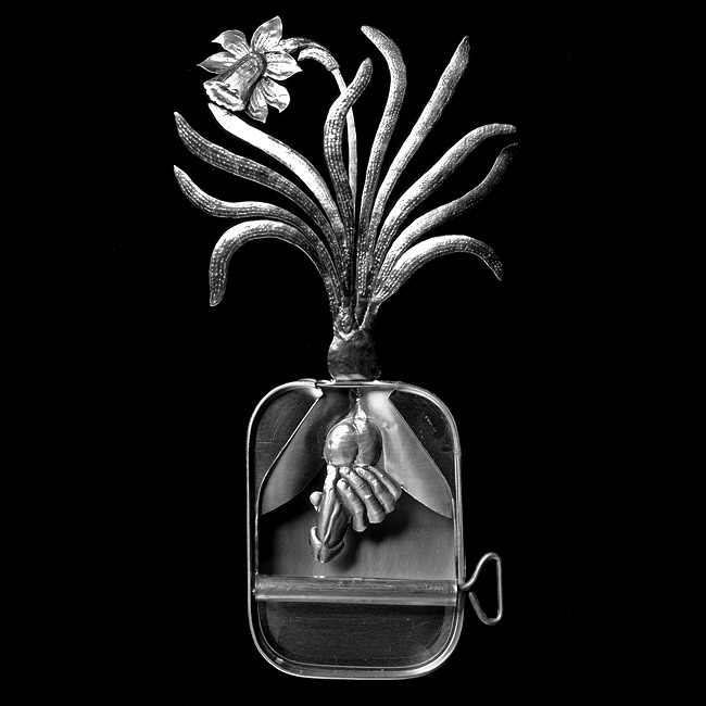
In an earlier series which I haven't seen in person, Paradisus Terestris, Hall creates intricate botanical sculptures out of sardine tins. The delicate, silvery sculptures speak of the vulnerability of plant species, and of the biodiversity present in Australia. Furthermore, the name of the series evokes themes of the garden of Eden, 'Paradise on Earth.' NB these ones are somewhat NSFW. Just a heads up.


  Fiona Hall, Paradisus Terestris 1989-90
images from Roslyn Oxley9

do the words lovely and hairy ever appear together?

Only when they are being used to describe the work of Evaline Tarunadjaja!

 Yet again this is a post-show-post. Evaline's deliciously light and airy pen and watercolour illustrations were on show at No Vacancy gallery last month. Evaline's work is full of long limbed, mermaid-like girls with hair mere mortals can only dream of. The level of detail and the intricacy of her line work, not to mention the delicacy and sensitivity with which she uses colour, are just astounding. Definitely one to keep an eye on.


All images from Evaline's website, here. She also has a blog and online store.Moreover, if you want to read a more indepth article with her, go here.

Mar 29, 2010

art after the fact 1: the endless garment at RMIT gallery

It appears that I am somehow unable to post my thoughts on an exhibition whilst it is still open, due to a stupendous combination of busyness, procrastination, and photo-distraction. Not only am I well overdue to write about the NGV's Ricky Swallow exhibition, but I have done the same thing with RMIT gallery's The Endless Garment: The new Craft of Machine Knitting which closed last week. 

The exhibition, timed to coincide with Melbourne Fashion Week, was both a celebration and exploration of the creative possibilities created by computerised industrial knitting machines. That sentence in itself sounds a little dry, but the pieces exhibited were anything by dry. Many were deliciously colourful, some were futuristic and unusual, all were technically innovative and enjoyable to look at. Ok, so not the first thing you'd think to wear whilst snuggled up by the fire, but inspiring nonetheless.


Sandra Backlund
image credit

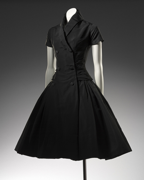
With a mother who teaches design, who in turn had a mother who was a dressmaker, fashion has always been vaguely on my radar. I'm not so much interested in trends or specific designers, but more in the way an individual garment has been constructed, and the ideas which are expressed in the final product. In fact one of the very first times I went to an art gallery was as a nine year old, with both mother and grandmother, to see Worth to Dior at the Auckland Art Gallery. Now let me reassure you; I don't have a freakishly good memory. Google came to my aid on that one. But I do remember sitting in the gallery with a little sketchbook, drawing all the dresses. Fifteen years later, I wonder what adult-me would think of such an exhibition. I think that gallery and museum exhibitions of fashion can run the risk of removing the garments from their social and historical context to the point that they are stripped of meaning. Furthermore, the way in which a garment moves in response to the movements of its wearer are lost unless there is some form of video display. 

 Dior 
image credit

I think the reason the Endless Garment worked for me was that the agressively contemporary nature of the garments combatted any historicising brought about by the gallery context. This was reiterated by the exhibition of experimental works created by the SHIMA SEIKI knitting machines, and of the machines themselves (they're rather funny looking beasts). The inclusion of the machines in the display creates a focus on process rather than fashion; ideas rather than trends. Far from historicising, the exhibition acts as a taste of the future and an instigator for further design innovation.

Cooperative Design
image credit

Another thing which struck me whilst at the exhibition was that the focus on computer aided design and knitting flies in the face of commonly held ideas regarding high-end fashion and the extent to which the artisan's hand should be present in the work. This triumphing of handmade, rustic, craft-based objects is big business at the moment. One only has to try to attend an exhibition opening at Craft Victoria to understand just how big the handmade-movement is in Melbourne. I am not trying to say that I don't like handmade objects. I do! I love Craft Victoria, and I was one of the fools who crammed their way into the afforementioned opening. But I think the handmade movement has a very loud voice, and in my mind, there exists alongside that loud voice, another, quieter voice, which is saying 'Actually, a deliberate pursuit of machines and their creative possibilities is just as interesting.' This is somewhat unsurprising, given that I am writing my thesis on the biggest machine-fanboys of the twentieth century, the Futurists. I could not help but think to myself, whilst watching the SHIMA SEIKI knit away, 'Clothes made purely by machines! Marinetti would have LOVED this!' Who are you calling a fangirl? Ok, maybe just a little. My point is that there are two oppositional threads running through art, fashion, design, even architecture, and I think  that both are worthwhile, and the interaction between the two is perhaps the most worthwhile thing of all. And it took an exhibition of machine knitwear to remind me of that. I say good work, RMIT gallery!

 Daniel Crooks
image credits 1, 2-3

PS: For an example of the machine-is-best thread in art, check out Daniel Crooks, seen above.

PPS: photography was not allowed in the gallery, so I don't have any images of the installation of the exhibition, but there are some good photos of it here.
Mar 25, 2010

diagonal lines and graphic design: rodchenko part 2

 Stairs//Young Pioneer
image credit: Artadox

“I want to take some quite incredible photographs that have never been taken before… pictures which are simple and complex at the same time, which will amaze and overwhelm people... I must achieve this so that photography can begin to be considered a form of art.”  
-- Alexander Rodchenko's diary, March 14, 1934 
[from Artadox]

Rodchenko's talents are not restricted to the photo-montages I posted about earlier in the month. No, that wouldn't be enough. The prodigious Russian artist was also a master photographer and graphic designer. I love his command of composition, his use of strong diagonals, almost to the point of geometric abstraction in a few of the photographs shown below. I could say more, but really, I think the work speaks for itself.

Part A: Photography

 image credits: 1, 2, 3, 4, 5, 6

Part B: Graphic Design

image credits: 1-3, 4

Mar 23, 2010

More goodness at Third Drawer Down: the green thumb edition

 Postcarden City, by Aimée Furnival

An equation for you: Postcard + garden = POSTCARDEN. Alterntively, a slightly simpler one: Third Drawer Down = AWESOME.

Not only do Third Drawer Down stock Melbourne's favourite limited edition, artist-designed teatowels and pillowcases, they also source arty, well designed goodness from all over the globe. Exhibit a: Vik Vidor's brilliant art print that I posted about earlier this month. Exhibit b: Postcarden, produced by Aimée Furnival of London's A Design Studio.

Postcarden is a creative combination of greeting and gift -- a pop up card that transforms into a mini garden. Each card comes with an inner growing tray, a packet of cress seeds and growing instructions. Frankly, I don't even posess a green fingernail, let alone a green thumb, but I think even I could manage to avoid killing cress. Plus I think it makes a great idea for city apartment dwellers who often have very little in the way of real, live green-ness around the house. 

Third Drawer Down only stock City, but there are in fact two more Postcardens: Allotment and Botanical. Making things even cooler, the exterior of the cards feature the work of up and coming illustrators Millie Harvey (City), Krista Nyberg (Botanical) and  Sophie Burdess (Allotment). Sadly, there is little to no information online about Aimée Furnival herself, but I imagine the person behind such a clever idea has many more projects in the pipeline.


1-3 Postcarden City
4-6 Postcarden Allotment
7-9 Postcarden Botanical


all images via www.postcarden.com


EDIT: I just found a cute video of the Allotment Postgarden on the rather amazing blog, That [Unreliable] Girl, AND as it turns out it was added to YouTube by none other than Postcarden designer Aimee Furnival. Enjoy.

even Holga gets the blues

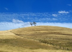
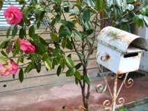
These are all from the final roll of Holga snaps I took in WA back in January. I wasn't particularly trying to shoot blues, but I do like how these look all lined up. Things have been a little busy of late, which is why I've been a little slow on the blog/photo front. But with my Nikon point n shoot fixed, and four rolls of film ready to print after a weekend away in Heathcote, something tells me I won't be quiet for too long.

Mar 17, 2010

that ol' stitchy feeling


As before, these were made using free software from DIPSTYCH. Full set here.
Related Posts with Thumbnails